TLDR – I’ve captured full GPS trace data of AFL games from the AFL Live app and I’ve uploaded the 2021 AFL Grand Final data here.
In the last few years there has been more interest in sport analytics, including the AFL, both at the amateur and professional level. The data-related features in media coverage of the game has seemed to increase too, suggesting that public interest is also there. The number of people providing amateur analysis on blogs and Twitter, etc. has increased dramatically, and a handful of these amateur “analysts” have since gone on to fill new professional roles at clubs, publish books, and land writing gigs in the media.
Quantifying the game is seen by some as ruining it, but the reality is that the AFL is a professional league and clubs are doing themselves a disservice by not exploring every possibly opportunity to succeed. I do refer exclusively to “AFL” as a competition here and not the sport itself, as all the relevant data is only available for the league.
Doing good data analysis requires good data. Champion Data is the official stat provider for the AFL (who owns a large chunk of Champion Data) and to my knowledge sells/gives to media and the clubs. The public only gets what has been published by those who buy the data. While the average punter may visit the AFL website for their data, more sophisticated data wranglers will seek out a third-party source (like AFLTables, Footywire, or more recently Fryzigg) that aggregates data in manner for easier consumption. While the tallies of data provided on these sites is good, the data lacks a lot of context! As an example, both an od kick to an unmarked teammate in defence, and a 50m bullet pass inside 50 to a key forward is registered as a “kick” (and both “effective”!) but the latter clearly is worth more to a team and should be credited as such.
There are a lot of identifiable variables that could be used to contextualise individual events (location, game score, time left, location of teammates and opponents, the weather, crowd, etc.). Champion Data’s “Player Rating” is the result of contextualising and “scoring” every player’s actions in order to quantify their contribution to the match outcome. In the previous example, the latter inside 50 kick would be worth more Rating Points than the defensive kick.
As Rating Points are available back to at least 2012, what this means is that Champion Data do have all the raw data to perform such analysis. However, if you, or I, or a club wanted to either replicate the analysis, or build their own contextualised rating system, this would not be possible as the raw data is not available. Even the clubs are only allowed to request their OWN players’ GPS data, meaning they would have no context around opponent positioning, etc.
It is entirely conceivable that someone (or a team of people) could manually transcribe every player’s location at all times during games by manually spotting and plotting off game footage. Besides being an absolute time sink (and maybe an abuse of human rights against the spotters), it would be prone to errors and entirely unnecessary as the data already exists. Manual transcribing must already be happening in clubland to some degree, where researching the setups of teams at stoppages and in defence, for example, are standard parts of opposition analysis. It has been suggested to me that Champion Data do not even have GPS data, and they have manually transcribed event locations themselves (this was definitely true at one point). Either way, a lot of repeated efforts could be saved, and the playing field would be levelled if everyone had the “official” raw data.
For clubs, data hunters, and collectors, the holy grail (I’m so sorry) of complete data would include:
- Full GPS traces of all players
- Timestamped, location-coded event data (possessions, disposals, stoppages, free kicks, etc.)
I’m happy to say that, actually, these sets of data are almost completely attainable, and have been since 2018!
The AR tracker
Before we get to the full data, it’s worth pointing out that the AFL have been releasing more data recently to keep us all interested. Late in the 2021 season, a new version of the AFL Live app was released with an “AR tracker” feature, an Augmented Reality which shows location-coded disposal data. The AFL has never released location-coded data before in this manner with this accessibility.
The visualisation of the data in the app (if you can find a flat surface) looks pretty, but for anything other than a casual look it’s not particularly useful as an analytical tool. If you wanted to do something else with the data (i.e. possession chains leading to goals, etc.), this isn’t possible as the raw data isn’t readily available. Thankfully, it didn’t take long for us enterprising amateur data nerds (and probably the club pros too) to strip the raw data out for use in other settings. A few people have already started to use the data to test out some fresh ideas.
The underlying data is quite rich, containing a large range of match events that are both time-coded and location-coded! However, it looks to have been adulterated to perhaps limit its usefulness. Only data from the 2021 AFL season is available, all locations are rounded to the nearest metre, and times are rounded to the nearest second. It seems like it was a conscious decision to both round the location data, and to not make more games’ data available. Alternatively, these positions may be from manual spotting rather than from GPS. This would still be an excellent data source if more games were available, and would be almost enough to replicate the Player Ratings (if the methodology was known). The second shortcoming is the lack of location data for players not directly involved in play, but we will see that it can be found.
Smart Replay – “Visions”
Sometime earlier, in 2020 (?), the AFL introduced a “smart replay” feature on their website. On it, you can select a player and game and an individual stat (i.e. Q1 02:51 Kick) and it will seek to the moment in the game footage so the stat can be seen in action – however it’s more likely that the broken AFL website will just play some random unrelated footage from the same game. Nevertheless, behind this fragile website feature is another nice data source. It’s effectively the same data as in the “AR tracker”, without the location embedded, and is available back to the start of 2017! I guess one could use the “smart replay” tool to comb through the footage and locate events manually, but why would you do that when we know that the players are wearing GPS trackers? Although it is missing location data, and the time-coding is rounded to the nearest second, this remains the best source of event data available at this stage. Among other things, this allows us to work out results like “scores from turnover”, something oft discussed on game coverage but not published as a “stat”.
Player Tracker
As discussed above, it turns out that the AFL does actually broadcast all the GPS data for all players, and it can be captured and (with some difficulty) read! On the AFL Live app, there is a Player Tracker feature during live games. Only during play, you can see the positions of every player moving live, along with some possession events, etc.
It’s not a particularly useful feature in this form, as it doesn’t show enough information, and seems to lag even on relatively high spec phones. You cannot rewind and replay so if you miss something live (or the data doesn’t update quick enough) it shits itself and plays catchup all the time. However, what this does mean is that the app receives live streaming GPS data for all players. Keep in mind that this includes data that the AFL/Champion Data don’t even give to the clubs! And it’s all right there, on their app that anyone can download.
Like all the other data provided on the AFL’s app and website, it’s not useful in its presented state, so we really need to find the source of the data to obtain it in a useful format, much like has been done with the AR tracker and visions data sets. I’m aware that some others in the Twitter community have found this data, but as far as I know none have decrypted it and/or published it. I would also be surprised if no club analysts have this data, given that me, as a hack coder fuelled primarily by heavy use of a search engine, has managed to do so.
This not intended as a tutorial but I’ll briefly outline the steps it took to produce the resulting data.
Step 1: Find the API endpoint
Finding the API endpoint that a website uses is often straightforward (say, using Developer Tools in a Chromium-based browser), but there’s a few more hoops to jump through to look at traffic from an app. As the app blocks rooted Android phones, basic Android sniffing tools were not useful. The solution that did work for me was to use a man-in-the-middle attack on the phone to view the network traffic from the phone on a desktop.
Step 2: Grab the data
Once the endpoint is found, it doesn’t require any complicated cookies or anything to get the data using say, Python’s requests library. Like when viewing the player tracker in the app, the data is only “live data”. It turns out that only the last 10 packets (even if you ask for the max of 20 packets) of data is available for each game at any time, so if you’ve missed it at the time it was gone… Forever! It turned out that each packet contained one second of data so the API needs hitting every 10 seconds. I saved a bunch down to look at later.
There may be an endpoint that retrieves past data but that’s not something I was able to find, if it indeed does exist. It’s also worth noting that the API response can actually be quite slow at times, leading to missing data – but obviously this could well be issues on my side.
Step 3 look at the data
It’s a lot of data! A whole match of raw data from the API works out to be about 500MB. A single packet (which is 1 second worth of data) contains a number of fields including the game clocks, a timestamp, players on the interchange, players missing from the data, possession events, and the data itself.
The data itself is encrypted and encoded in a Base64 string of about 74,000 characters per second of data, and is absolutely useless until it is decrypted. The possession events are not encrypted/encoded and will be discussed later.
Step 4 decrypt and parse the data
With a bit (well, a lot) of work, the encryption method can be sussed out. Once it’s known, the data can be quite quickly decrypted using common crypto packages in any number of programming languages (I stuck with Python as I do).
There was a bit more work to do after decrypting, as the data was serialised in Protocol Buffers (protobuf) format before being encrypted, so that needed to be backed out also. Even if nothing had come out of this I’d definitely have learned a lot!
After these steps, you get 10 lines of data per player in a single packet (second) of data. Then It’s a matter of rinse and repeat for the remaining packets available, join them all up, and the GPS trace data is complete!
The Data
I’ve uploaded the data I captured from the 2021 AFL Grand Final. I have trimmed a lot of useless columns out of the raw data, and applied minimal processing. If you just want to jump right in, grab to data, unzip it, and run my iPython notebook to have a look at some very basic use of the data.
The “complete” zipped data is split over three files, which are comma-separated-value formatted:
- GPSsample.csv – GPS traces (LARGE: 350MB)
- possample.csv – Possession events
- vissample.csv – “Visions” data
I’m not fully aware of what the circumstances around what the AFL is allowed to do with the players’ personal GPS data, but given what I captured was readily available on the AFL’s app during the game, in my view it’s been made public enough to share.
Finally, my notes on and interpretation of the data below are based off my observations only and may well be misguided or just plain wrong!
GPS Trace
I’ve uploaded data for the entire game without pauses, starting a number of minutes before the first bounce, and through until after the final siren.
| name | timeEpoch | x | y | countdown | countup | timeon | hkl | home |
| BFritsch | 1632560973050 | 0.081798 | -0.25057 | 327 | 26 | 0 | 0 | 1 |
| MHannan | 1632560973050 | -0.12397 | -0.21145 | 327 | 26 | 0 | 0 | 0 |
| ANaughton | 1632560973050 | -0.09799 | -0.18903 | 327 | 26 | 0 | 0 | 0 |
| TEnglish | 1632560973050 | -0.09739 | -0.24415 | 327 | 26 | 0 | 0 | 0 |
| LVandermeer | 1632560973050 | -0.10679 | -0.21103 | 327 | 26 | 0 | 0 | 0 |
| BSmith | 1632560973050 | -0.1003 | -0.19873 | 327 | 26 | 0 | 0 | 0 |
| KPickett | 1632560973050 | 0.09499 | -0.17277 | 327 | 26 | 0 | 0 | 1 |
Notes:
- Don’t bother trying to open and work with this in Excel, it’s too big.
- Here timeEpoch is the timestamp in milliseconds since 1st January, 1970 (UTC)
- The co-ordinate system is centred at (x,y)=(0,0)
- The “left” goal is centred at (x,y)=(-0.5,0), and the “right” goal line is centred at (x,y)=(0.5,0)
- The “near” wing appears to be at (x,y)=(0,-0.4) and the “far” wing is at (x,y)=(0,0.4). Benched/subbed players seem to hang out around y=-0.5.
- The value of +/- 0.4 for boundaries is just an observation. It is possible this could vary depending on ground aspect ratio. The ground for this game is approx. 165m x 130m.
- The timestamps on the data do not seem to be very precise, it seems to lag/lead actual play by a few seconds when comparing with game footage and visions data. It seems to be a consistent break though so there’s obviously synching issues.
- “countdown”, “countup”, and “timeon” are the self-explanatory period clocks. This data also includes pre-match and quarter-break “periods” without break. It is actually not trivial to split this data into quarters, and to discard non-play periods.
- “hkl” is 1 if the home team is kicking left (this switches every quarter)
- “home” is 1 if the player is in the home team – handy here as I’ve anonymised the names in no particular order.
Possession Events
| name | time | pt | x | y | hp |
| RSmith | 1632561668955 | 0 | TRUE | ||
| HPetty | 1632561682955 | FALSE | |||
| 1632561682955 | -0.23991 | -0.25205 | FALSE | ||
| 1632561698955 | 0.036014 | -0.30376 | FALSE | ||
| MGawn | 1632561702955 | FALSE | |||
| MBontempelli | 1632561706955 | 1 | TRUE | ||
| CDaniel | 1632561708955 | 2 | TRUE |
- “time” is in the same form as the GPS trace data. However, it seems that this is the timestamp of when it is sent in the data stream, NOT when the possession was recorded, so there is a delay here and it is not a consistent lag.
- “pt” is presumably “Possession type”:
- <blank> means a play restart (centre bounce, throw in, etc.)
- 0 is a mark (receive from kick)
- 1 is a ground-ball get (either loose ball or bounced kick/handball)
- 2 is a clean handball receive
- 3 is a free kick
- 4 is for end of period (not actually in this dataset)
- Co-ordinates “x” and “y” are only given for stoppages, unfortunately. Also, because the timestamp is not actually the time of possession the GPS trace data cannot be used to fill in the gaps here.
- “hp” is TRUE if it is actually a possession, otherwise it is FALSE when it’s a stoppage, or it’s a non-possession stat (i.e. a hitout or spoil)
- Disposals are not in this data
- The sample data above can be interpreted as:
- RSmith marks
- HPetty spoils over the boundary
- Location of where the throw-in started from (the co-ordinates look way off for this line)
- Location of where the throw-in lands
- MGawn gets hitout
- MBontempelli gathers loose ball
- CDaniel receives handball
- As the timestamps are not representative, I actually don’t find any use for this data once the visions data is available post-game. As it is live, it is however useful to contextualise my scoring shots on my live expected score Twitter bot @AFLxScore
Visions Data
I’ve taken the raw data available from the API (and also published by alittle), and trimmed a few columns. I have “exploded” the stats list column so that there is one line of data per “stat”. Additionally, I have added and further contextualised some events to my liking, i.e. I mark contested possessions from stoppages as “stoppagePossession”. Feel free to do your own thing with the raw “visions” data if you prefer. Everything in this data should hopefully be self-explanatory.
| Name | time | home | Stats | period | periodSeconds |
| JMacrae | 1632561356000 | 0 | centreStoppage | 1 | 0 |
| JMacrae | 1632561356000 | 0 | centreStoppagePossession | 1 | 5 |
| JMacrae | 1632561356000 | 0 | groundBallGet | 1 | 5 |
| JMacrae | 1632561356000 | 0 | handball | 1 | 5 |
| JMacrae | 1632561356000 | 0 | disposal | 1 | 5 |
| JViney | 1632561356000 | 1 | tackle | 1 | 5 |
| MGawn | 1632561360000 | 1 | contestedPossession | 1 | 9 |
| MGawn | 1632561360000 | 1 | groundBallGet | 1 | 9 |
What have I done with this data?
Unfortunately, the data sets I have been able to capture live is limited, and I have no way of obtaining more, so it’s difficult to commit to any large projects without the ability to guarantee a more complete set of data.
I have however, attempted to location-mark the visions data of a few games I do have by using the GPS traces, with some success. As the GPS timestamps are not synched properly, each game requires manually adjusting the GPS timestamps by matching with the game footage. As the visions timestamps are to the nearest second, I located each event by the players average position in the second around the event (after adjusting for the GPS lead/lag)
I posted this visualisation on Twitter a while back (around the time the AR tracker came out). I actually said at the time that I used the AR tracker data, but that was a lie. The visualisation shows ball receipt location and disposal location from the GPS data, and though I hadn’t, I guess I could have plotted the whole trace between receipt and disposal rather than a straight line.
I have also knocked up a little iPython notebook that demos how to use the GPS data to calculate a player’s maximum speed for the match. This was also bit of a test to make sure things lined up with the “official” tracker results. It turns out it can come pretty close to matching maximum speeds, but more pre-processing of the data needs to be done to filter out any junk points
What can you do with this data?
This is where you come in! What would you do with this sort of data if you had a large dataset? What would you like to see done? Do you think it would benefit the game?
There was a pleasing number of responses on my below teaser Tweet with suggestions as to what could be done with the data. Most of this is definitely achievable, but all rely on having a large amount of data to detect trends, compare players/teams vs. different opponents, etc.
What next?
Data analysis in sport, like it or not, is here to stay. To thrive it needs good data. For whatever reason (and this may include contractual agreements with the players) the AFL is very protective of its data. Yet, I’ve shown that it is already broadcasted publicly on their app – hidden, but insecure – for all to see, and someone will always be enterprising enough to capture it.
I do have more of this data from the last season (and 2020, and maybe some 2019?), but I’m sure there are plenty of missing games. Further, I am unsure how complete each game’s data is. The volume of the data means it will take me a while to work this out, and the nature of the data capture method means any missing data cannot be obtained. Once I have been able to filter through and process my raw data, I will hopefully have a larger set of data to share with the community. If I do, I would very much appreciate feedback on the format of data I’ve presented here and if there is anything obvious I’ve missed.
-AT


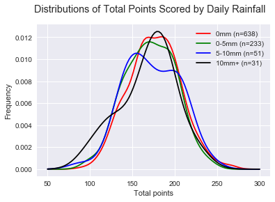
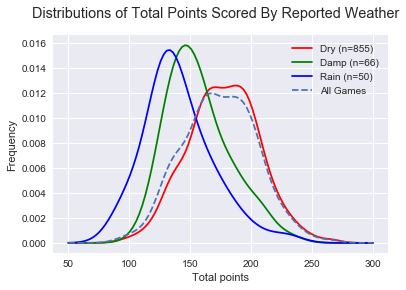
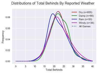
 , p(Dry~Rain)<
 , p(Damp~Rain)
 ) and are logical in that a dry game is expected to be higher scoring than a damp game, and damp game higher scoring than a rainy game.

 There is less efficiency in “Rain” games, as expected, but even less in “Damp” games! Perhaps this can be explained by teams not respecting slightly difficult conditions and trying to play a normal game style. While we’re on Inside 50s, Marks Inside 50 are a strong predictor of AFL success.
 Indeed there are less Marks Inside 50s in weather-affected games. Not surprising at all, it’s harder to mark in the wet and harder to hit targets.